I have decided to give the landing page we where looking at in this assignment an over all score of 3.8/5 in accessibility. In this post I will explain why I am landing page this score in accessibility.
What needs work
While looking through the website I noticed that there was some semantic html tags could have been added. To be specific adding a main tags for the main content and changing putting the smaller headers in the card in a heading tag instead of span tag. This would make it easier for with low vision that rely on screen readers to find this content. 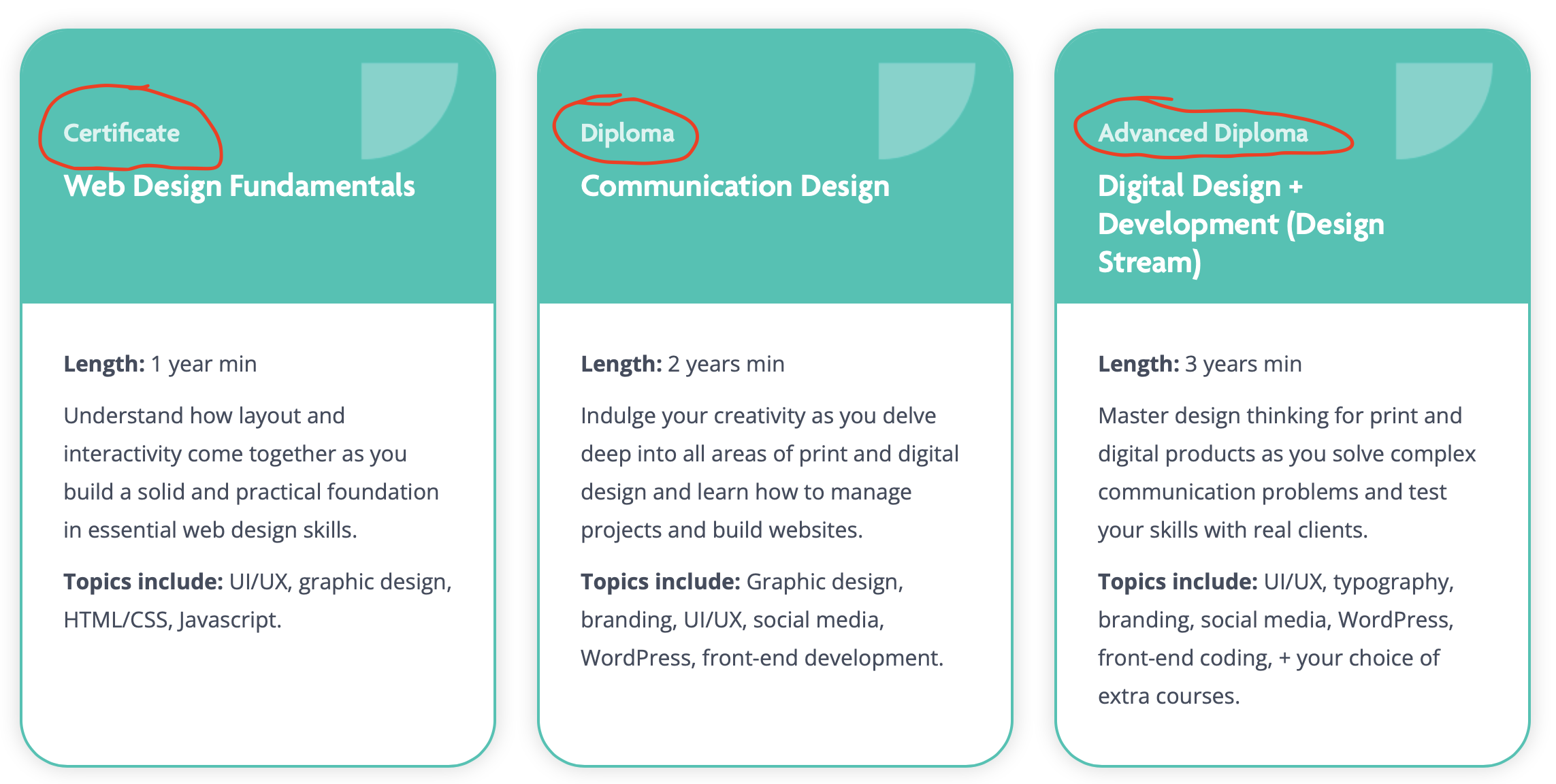
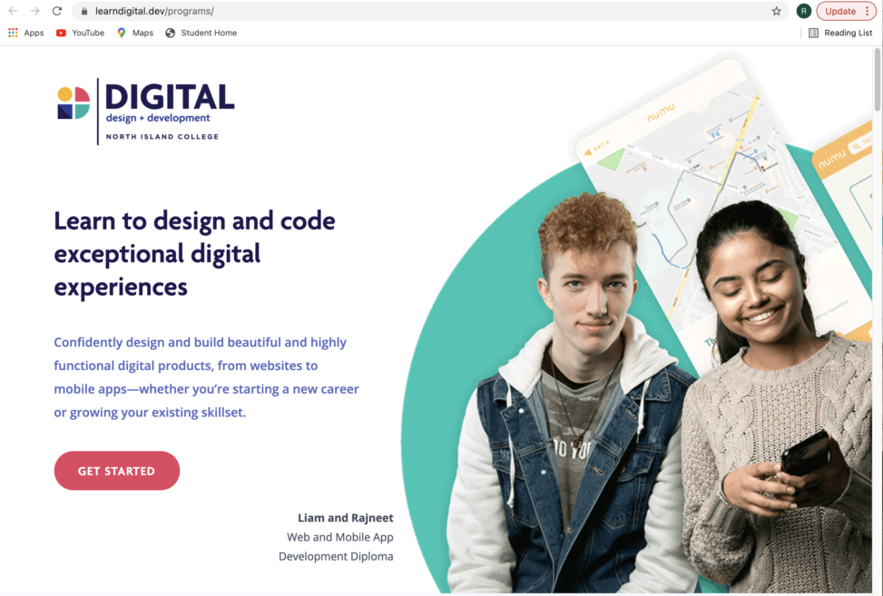
There are also a few back ground images that are left without alt text. This can present issues for people who are unable to see the images for any number of reasons such as being low vision or having images disabled on their devise to save data. For this reason all images should have alt text attached to them with the only exception of background images that are surviving as decoration/texture.
Links that take you into a different page be identifiable to screen readers. This in one of two ways the first is adding aria-label and the second being adding a element tag only visible to screen readers. 
What is good already
The landing page is well chucked with all relevant topic put together and avoid large blocks of text. This combined with the use of a clear visual hierarchy made with the headings makes it easy for people to navigate and understand the content.
The font choose and size are easy to read both scaled up and down. The spacing and having a left aligned text other features used that should be noted for having it easy to read for English. This maybe different for other languages.
All of the bottoms and things that look like they should take you somewhere do. You don’t want your website to surprise the users.
Contrast for the most part is good, although there are a few area where Accessible may argue. I do not feel that I am a good judge of this matter as I am not colour blind or part of the visually impaired community.
Final thoughts
My final thought on the for the most part it is reasonably accessible. Most of the problems noted are not detrimental and only will be an inconvenience for someone with a disability or in other words it falls into the category of moderate under the Four Categories of Accessibility Challenges. Over all I give the landing page a ranking of 3.8/5 in accessibility.
Leave a Reply